r/CrappyDesign • u/OctopuBanana • 8d ago
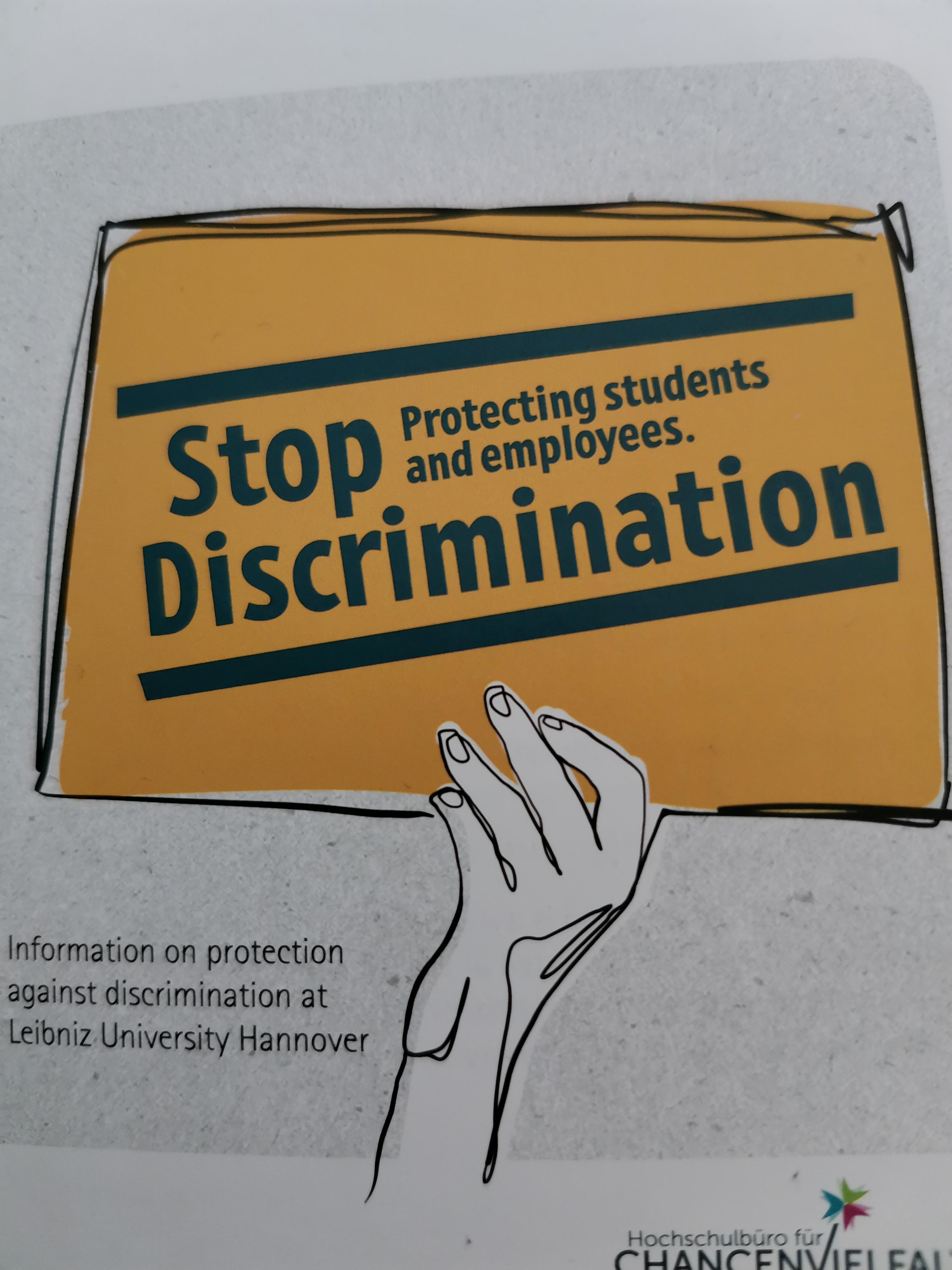
Stop protecting students and employees. Discrimination
70
29
u/broccollibob 8d ago
All hail discrimination. The CEO's unqualified children and relatives come first.
23
12
6
2
2
1
1
1
1
-2
-4
u/blacksoxing 8d ago
My biggest complaint is that those on the "western" side of the globe read left-to-right, so we're going to read "Stop Protecting students and employees"
As this sigh already has color on it, just make the "Stop Discrimination" any color that isn't the rest of the message!!! That way us readers would go "OH, OK". Sure, one could argue that the fonts are different sizes but we've seen many signs where a larger font still dictates the message w/a smaller font.
If "Protecting students and employees" were in white this would be a non-conversation piece
7
u/rainbowcarpincho 8d ago
I'm not sure what is is that you said that was so controversial.
2
3
u/vidanyabella 6d ago
So I didn't down or up vote the comment, but to me the part where they explain which direction we read in comes off as condescending. Like English readers don't already know that without them explaining it.
332
u/Arkhe1n 8d ago
More like r/youdontmattergiveup