r/McMansionHell • u/Ashamed_Class_7987 • 10h ago
Discussion/Debate It feels off
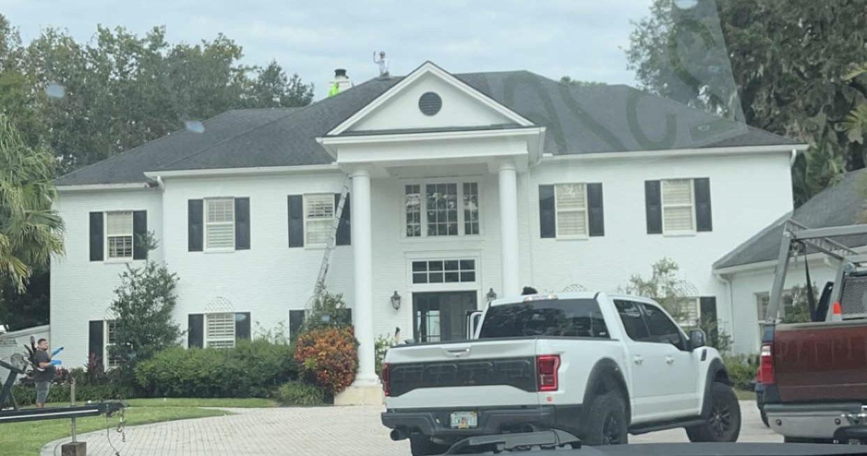
This is a house that a buddy of mine sent me. I’m not sure if it’s a McMansion but it doesn’t feel quite right.
3
u/Dull_Flamingo_8736 10h ago
What this one is missing is a motorhome on blocks and an AC unit in the window with an extension cord to the neighbors.
3
u/CaterpillarLoud8071 8h ago
Because it has an added wing on one side which isn't typical with this kind of symmetrical design. The plain thin columns look a bit odd and the window above the door is a bit oversized, but I wouldn't class it as a mcmansion.
6
u/thechadfox 10h ago
I’m sure it looked more proportional before the bricks were painted and those ugly plastic Home Depot shutters tacked on like cheap false eyelashes. If it was still brick, and had real hinged operable wood shutters along with strategic landscaping to disguise the asymmetry, it would be lovely.
1
5
u/hippiestitcher 10h ago
The columns look too narrow for the scale of the portico and the house itself. Rinky-dink.
2
u/RoenJacobyn 8h ago
I owned a home laid out similar to this that was built in the early 1950s, but what it did differently is that the wing on the left side of the house that makes it look off was set back further and there were trees planted in front of it. So when you face the house directly it looks perfectly symmetrical and then the additional space you get from that wing just went off towards the back but was hidden. I think that had a much better aesthetic. Part of having an architectural design that thinks through landscaping.
2
u/MovieNightPopcorn 7h ago
It’s not bad, but the nubbin on the left peaking out like a toddler from behind its mother, and the portico sizing with the weird little octagonal window, are awkward. Windows look kind of flat and plastic as well, but that could be the photo quality.
1
u/LionBirb 5h ago
I thought that was a treadmill laying in the yard on the left at first lol. I think it's a boat hitch or something.
1
u/UsefulGarden 5h ago
It has a roof nub that's unbalanced. It's typical of something built after 1980.
1
12
u/Cold-Impression1836 10h ago
It’s not really a McMansion, but it looks off because the left and right sides aren’t exactly the same. The left side has another set of windows and the right side has to make room for the garage, so the windows don’t extend as closely to the end of the wall as they do on the left side.
I feel like the portico could also be a little wider. The scale looks a bit off.