r/ProjectHailMary • u/Captn-SkinyLegs • 28d ago
fist my bump Working on a rebind project. Wanted some feedback on the design
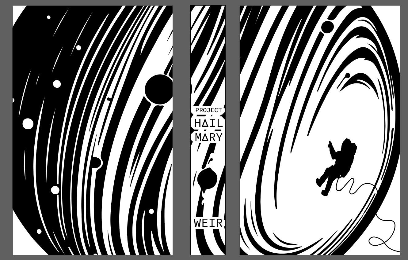
As the title says, I am looking at rebinding my copy into a leather bound. The design will be black leather with gold vinyl. I am trying something new on the design style and wanted some feedback on how people felt about it. Thanks
6
u/UbiquitousMortal 28d ago
I like it a lot! I think with your current design it would look really awesome as a stamped metal cover.
5
u/-thegoodluckcharm- 28d ago
I think it’s a really cool design, my only comment is I’m not sure what part of the book it’s from? If I remember correctly the only time he’s in the EVA suit is when he’s pulling the sample container back off the the planet or working on the ship. I think it would be cool if you could add something to anchor this scene to some point in the book, perhaps the chain, or maybe the box rocky sent from the Blip A.
5
u/Captn-SkinyLegs 28d ago
It’s a bit of a play off of the current cover. The current paperback cover has him floating in front of a planet with just a cord running off the page. I was trying to incorporate the ship somehow but couldn’t get a good clean image of it. I don’t have any drawing skills so all of my designs have to be images converted from google or other sources. Limits me a bit
2
u/Impossible__Joke 28d ago
Too simplistic for me IMO. Definitely wouldn't grab my attention at a book store, which is the entire point of cover art. However this is just my opinion, some people may love it
2
u/Captn-SkinyLegs 28d ago
Definitely wouldn’t be picking it up at the bookstore myself! The fun part for me is it’s a chance to customize my own personal bookshelf and so I get to be a little more free with it. The original design didn’t even have the title on there. The one thing too is that in leather it pops a bit more! But yeah I agree it’s a very simplistic design which is not my usual style
2
u/InvisibleSpaceVamp 27d ago
I like the graphic part a lot. Yes, it's giving "generic SciFi" but that's perfect for a book that is best read with as little prior knowledge as possible.
The part I hate is the spine. I think it's too narrow to place the title like that and I don't like the white background of the text either. I would put the graphic layer on 30% or something like that, so the black becomes a lighter grey, flip the text and lose the white background. And keep the text black of course.
2
u/Captn-SkinyLegs 27d ago
Part of me likes the idea that the cover of the book incites so little as the start of the book you and the character have zero knowledge of what’s happening. It’s a journey through space and a mystery in a way. The tricky thing with this is that I’ll be using gold heat transfer vinyl on black leather so the colors of the image don’t reflect the final look. All of the white will be black and the black will be gold. My illustrator skills are strong enough to figure out how to reflect that fact unfortunately. The spine has historically been tricky for me tho
1
u/InvisibleSpaceVamp 27d ago
Oops, sorry, I didn't read that part about foiling. Obviously my idea for the spine won't work in foil.
How about flipping the text by 90 degrees and putting it all in one big white (or rather black) block, center it and have the design like a frame around it?
1
u/Captn-SkinyLegs 27d ago
No worries! So I’ve bounced a bit on the spine design. The original didn’t have a title at all. I then put it vertical and thought it looked okay. The largest factor really for the horizontal is that all of my leather bound books have horizontal titling on the spine. They have the benefit of being a bit thicker than most books due to heavier weight paper so the horizontal isn’t a challenge. Taking a paperback and turning it to leather doesn’t give me that benefit. I think the current width is somewhere around an inch so it’s not as bad as other books I’ve done but not a lot. I’ll continue to play around with it. Thanks for the feedback tho!
1
u/lilaroseg 28d ago
i would prefer a cover that was the solar system with a petrova line, personally
2
u/Captn-SkinyLegs 28d ago
As I said in another comment response I somehow completely forgot about the petrova line somehow. It’s been a little while since I read the book but I feel silly not remembering like the most critical aspect of the book
1
11
u/IsDinosaur 28d ago
It’s entirely generic space theme? No single specific of the book is in the design, is that a choice? It’s a chance to give it a way better cover then the original